Role: Graphic designer for Accent Design
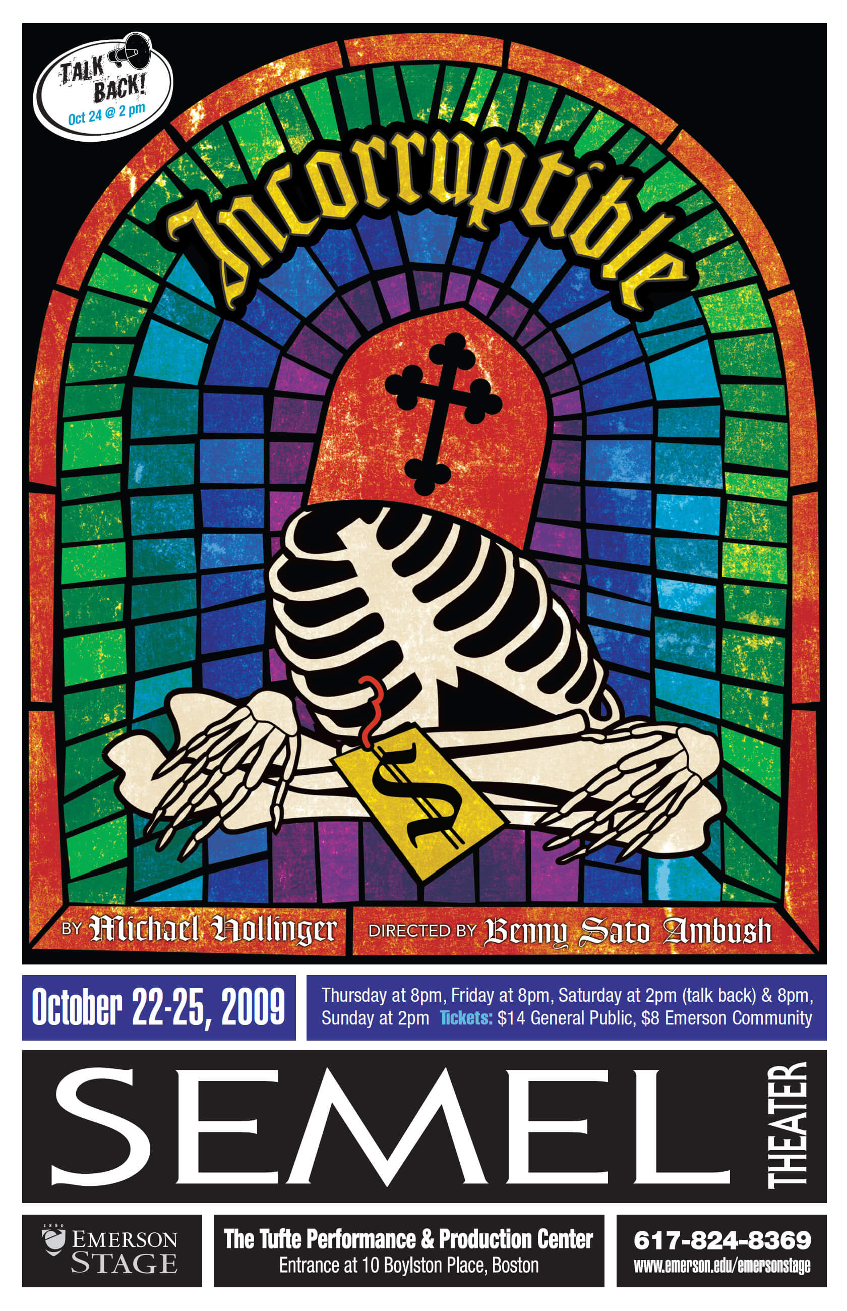
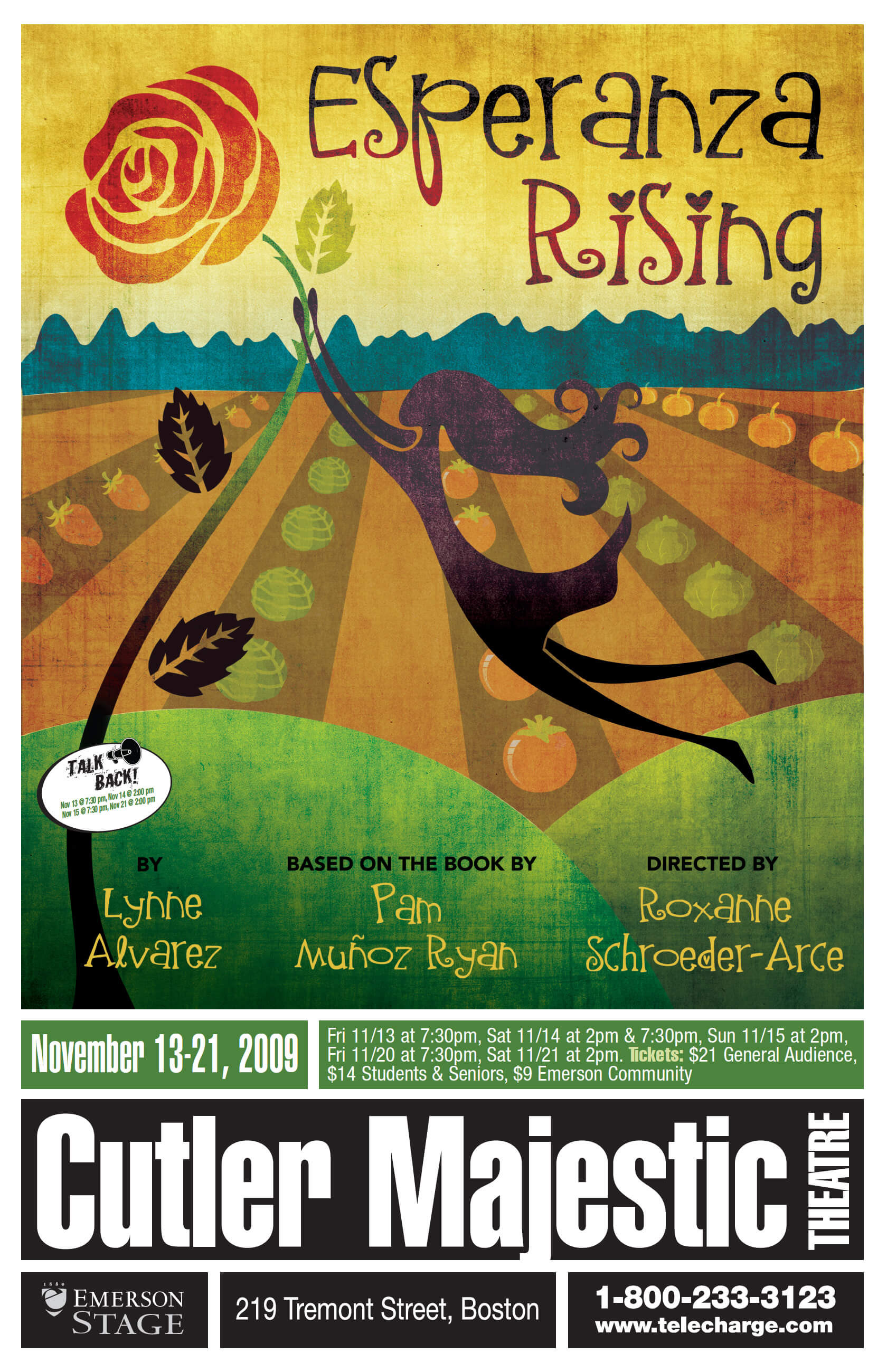
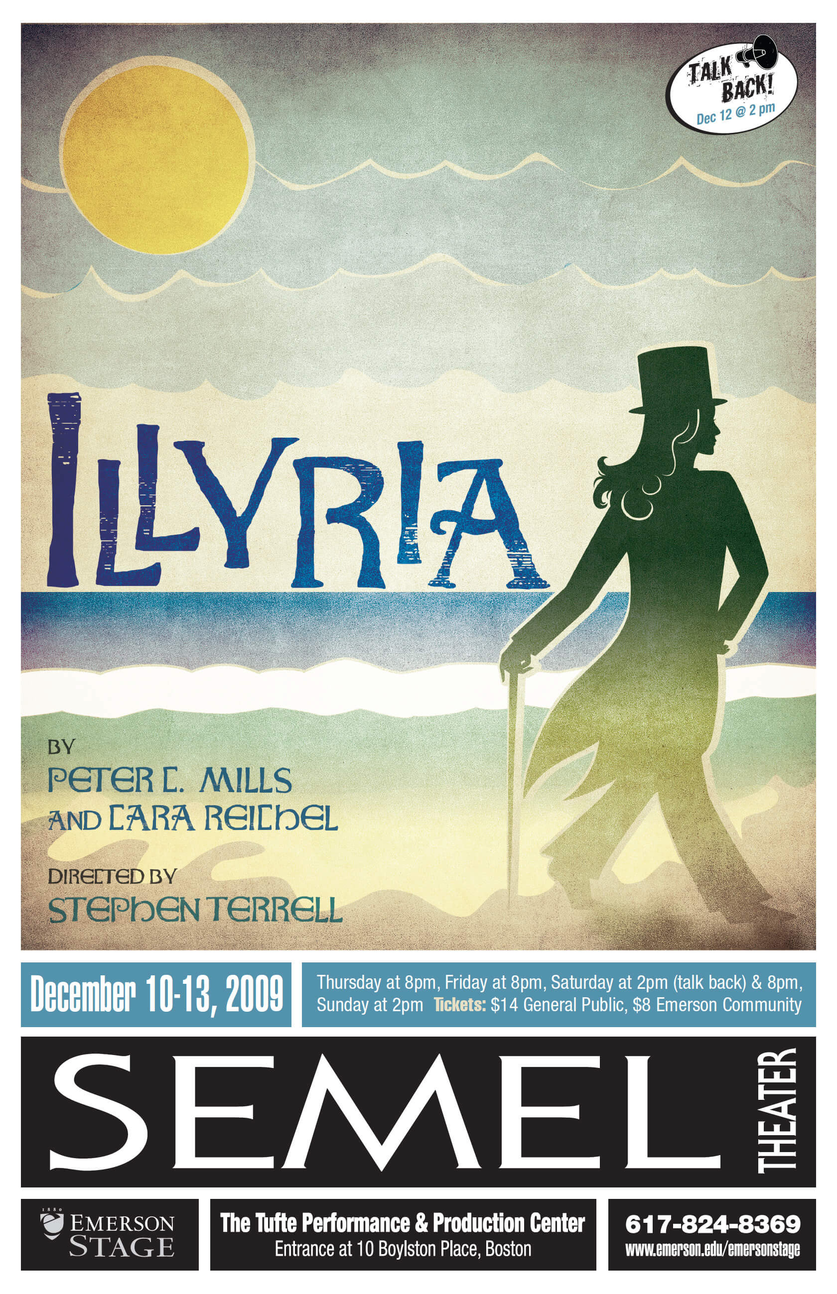
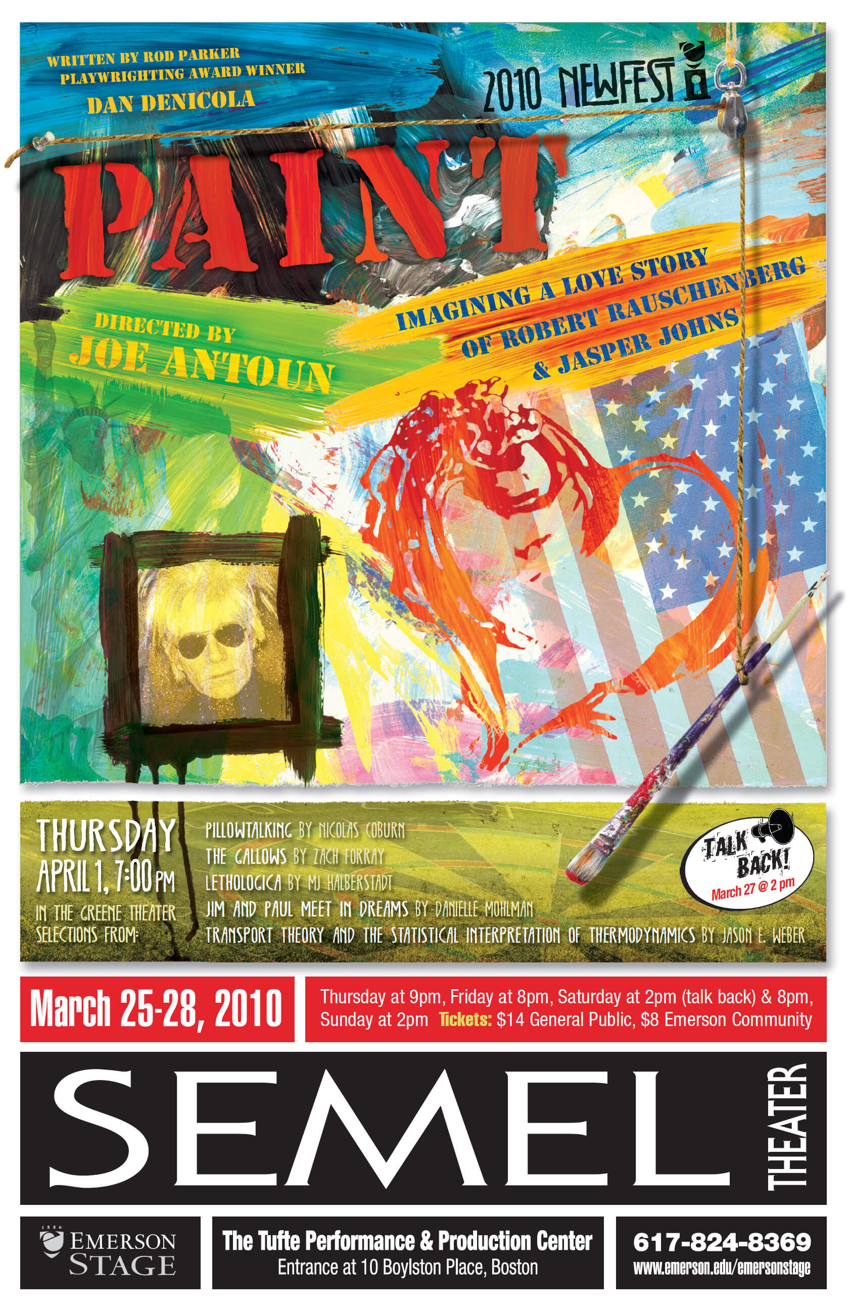
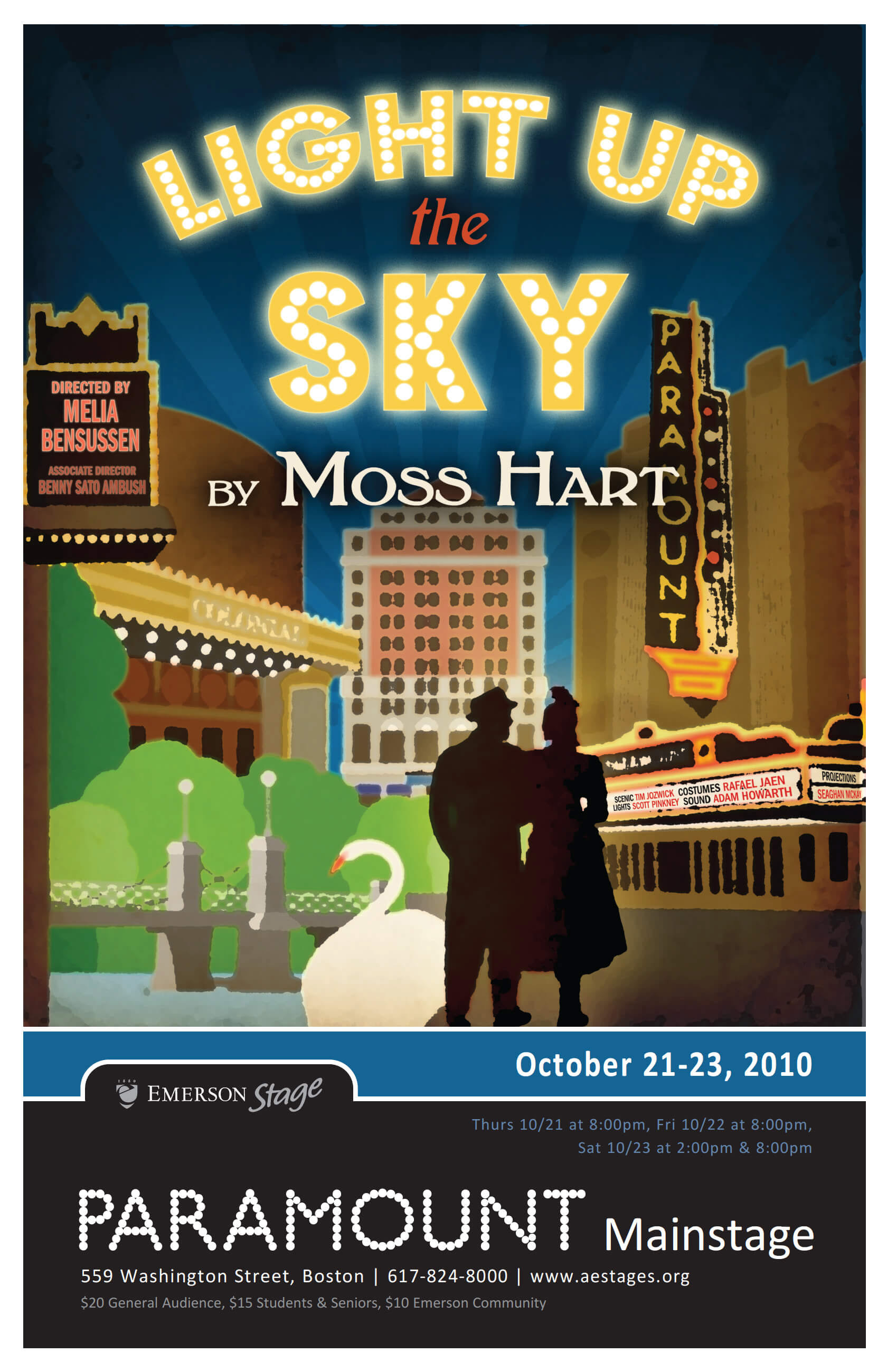
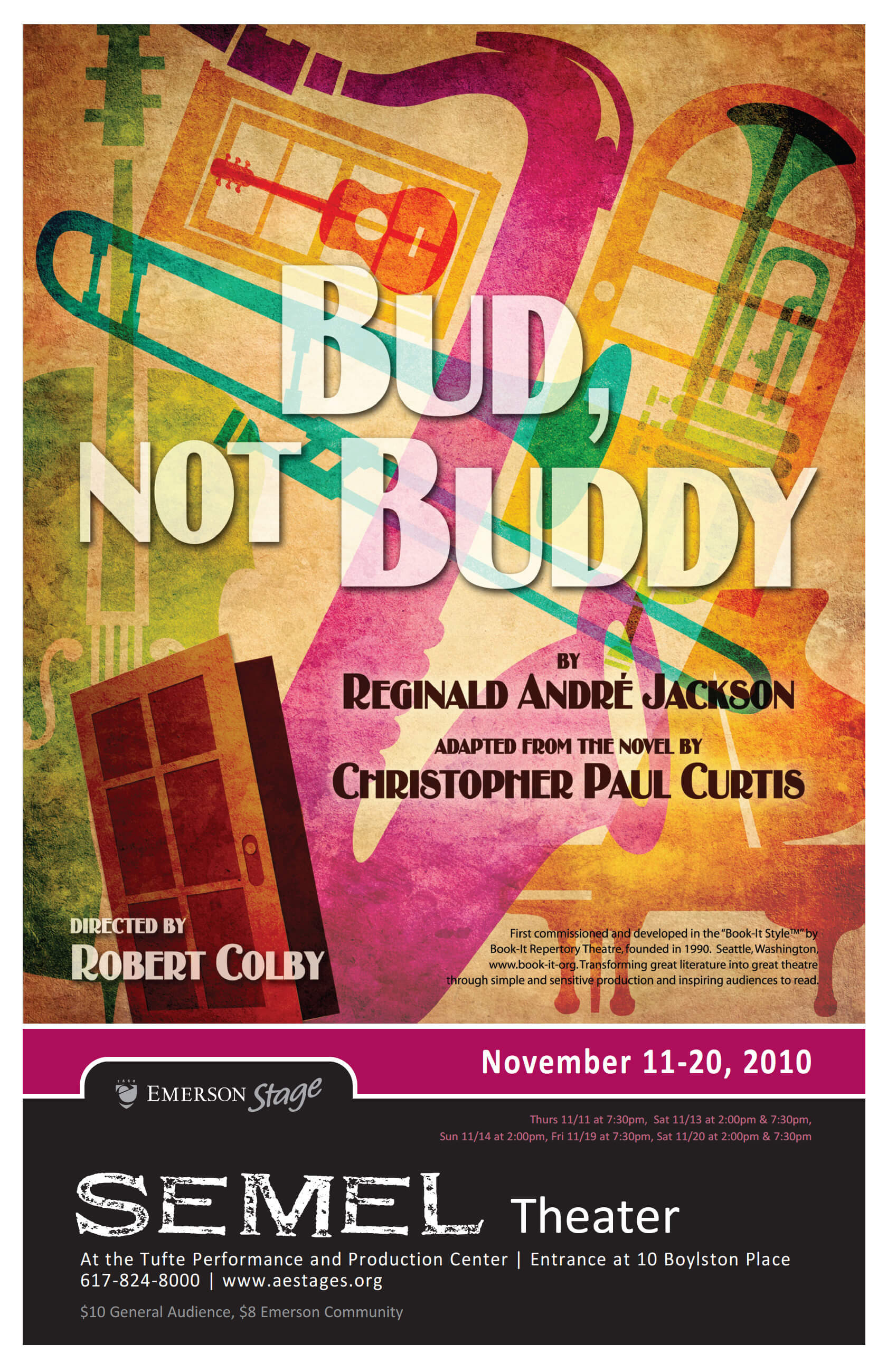
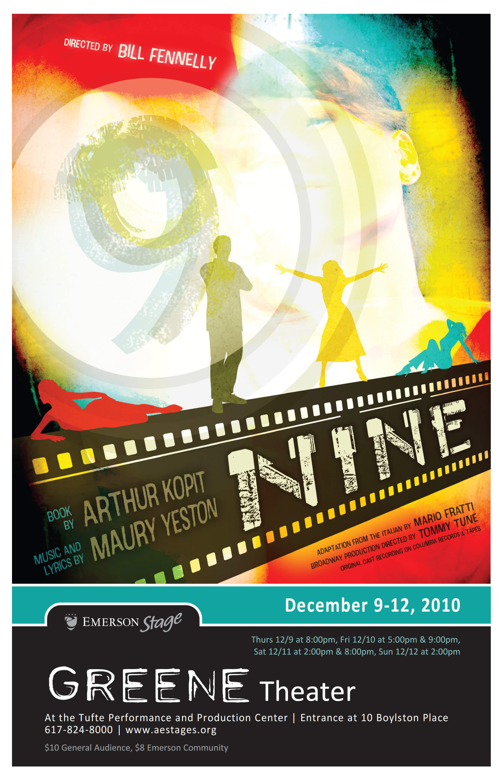
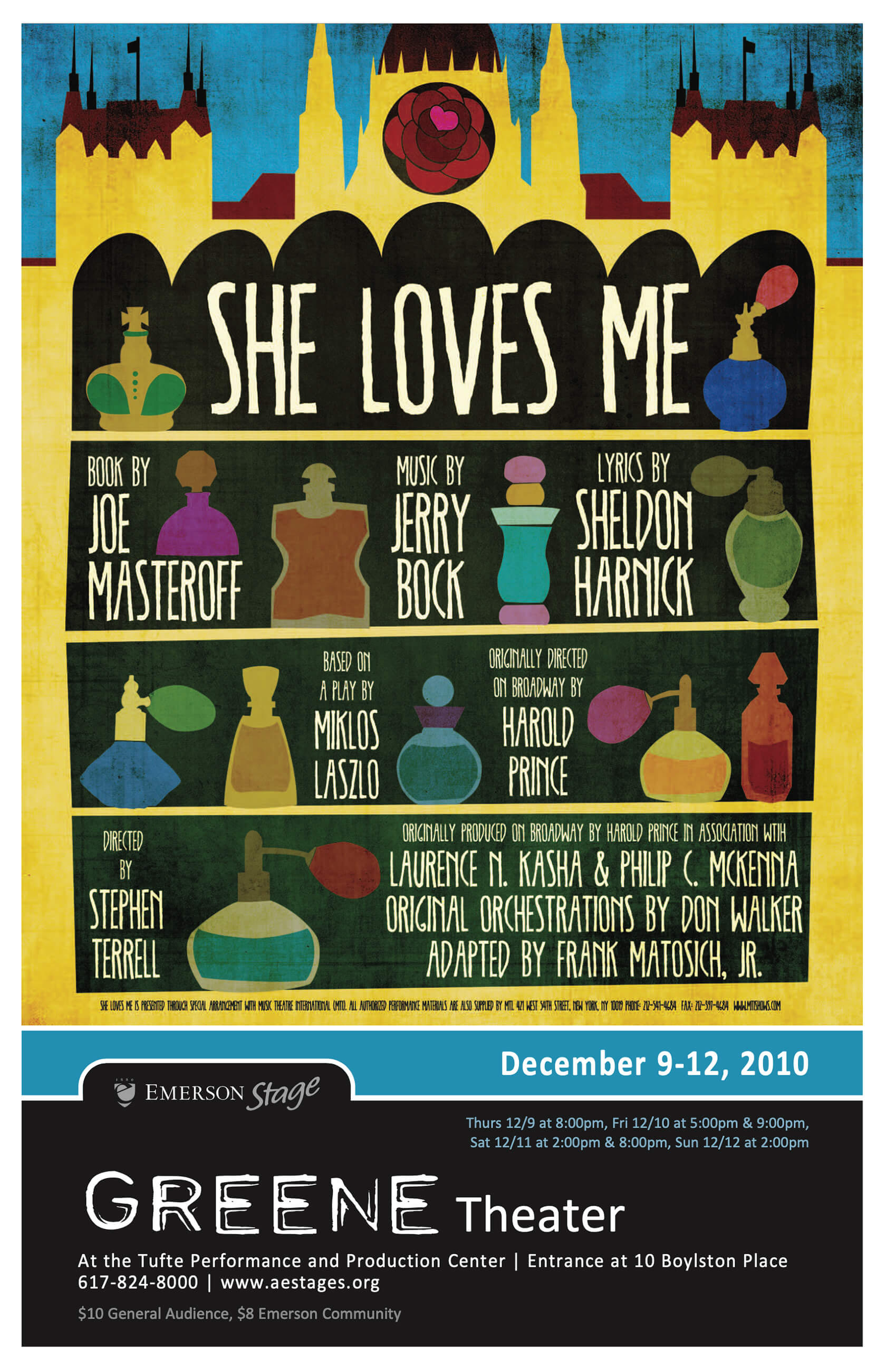
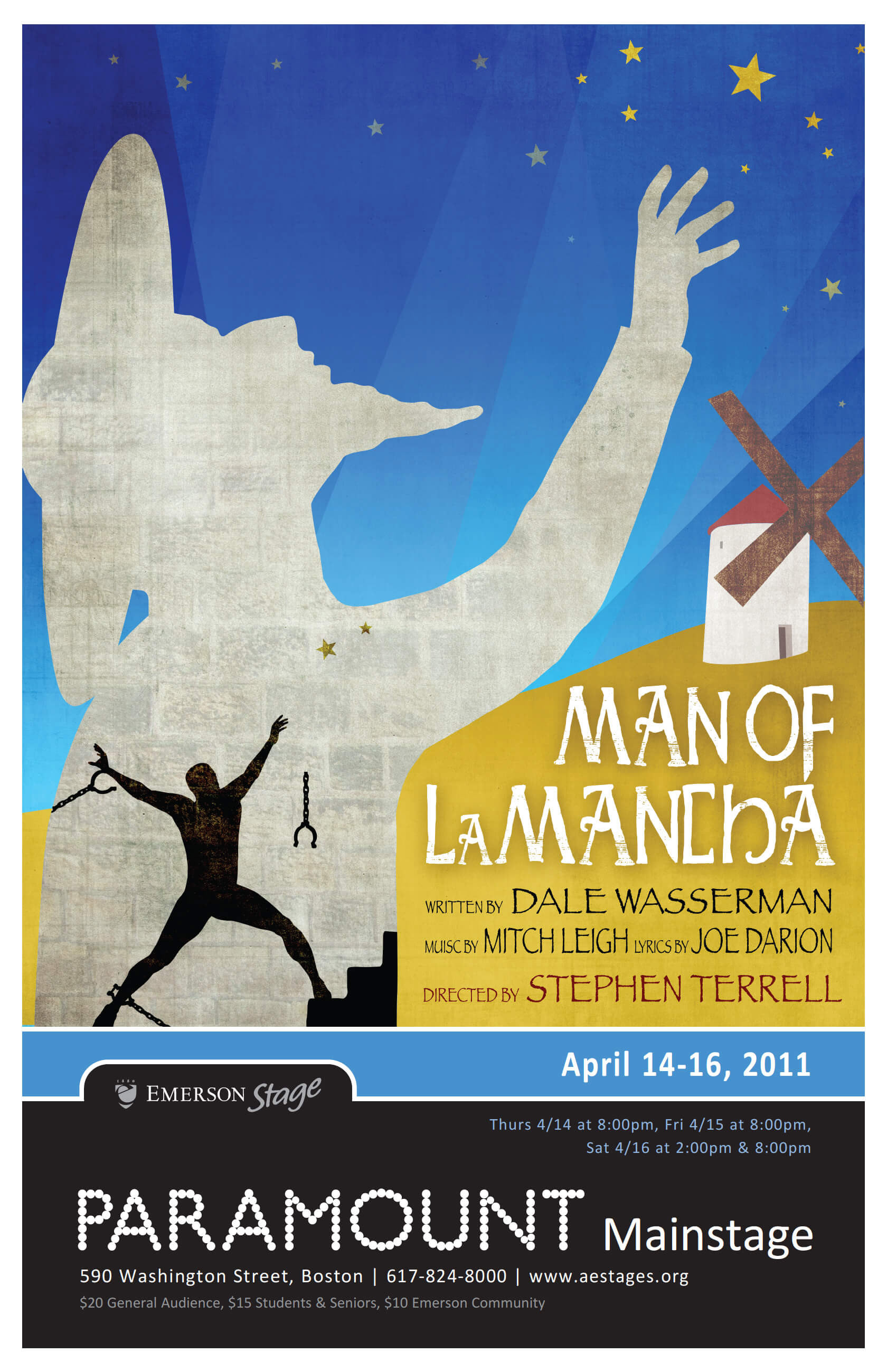
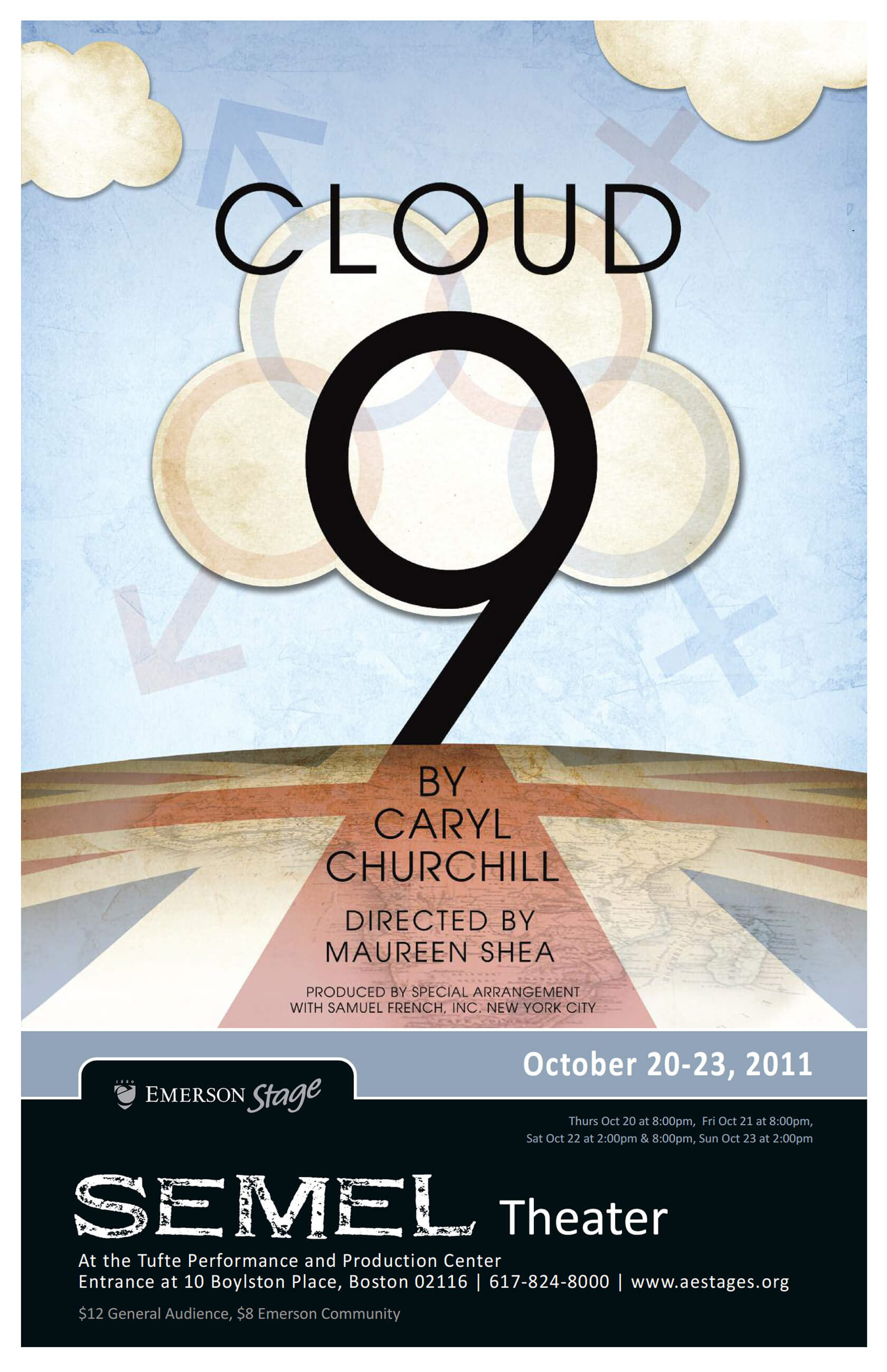
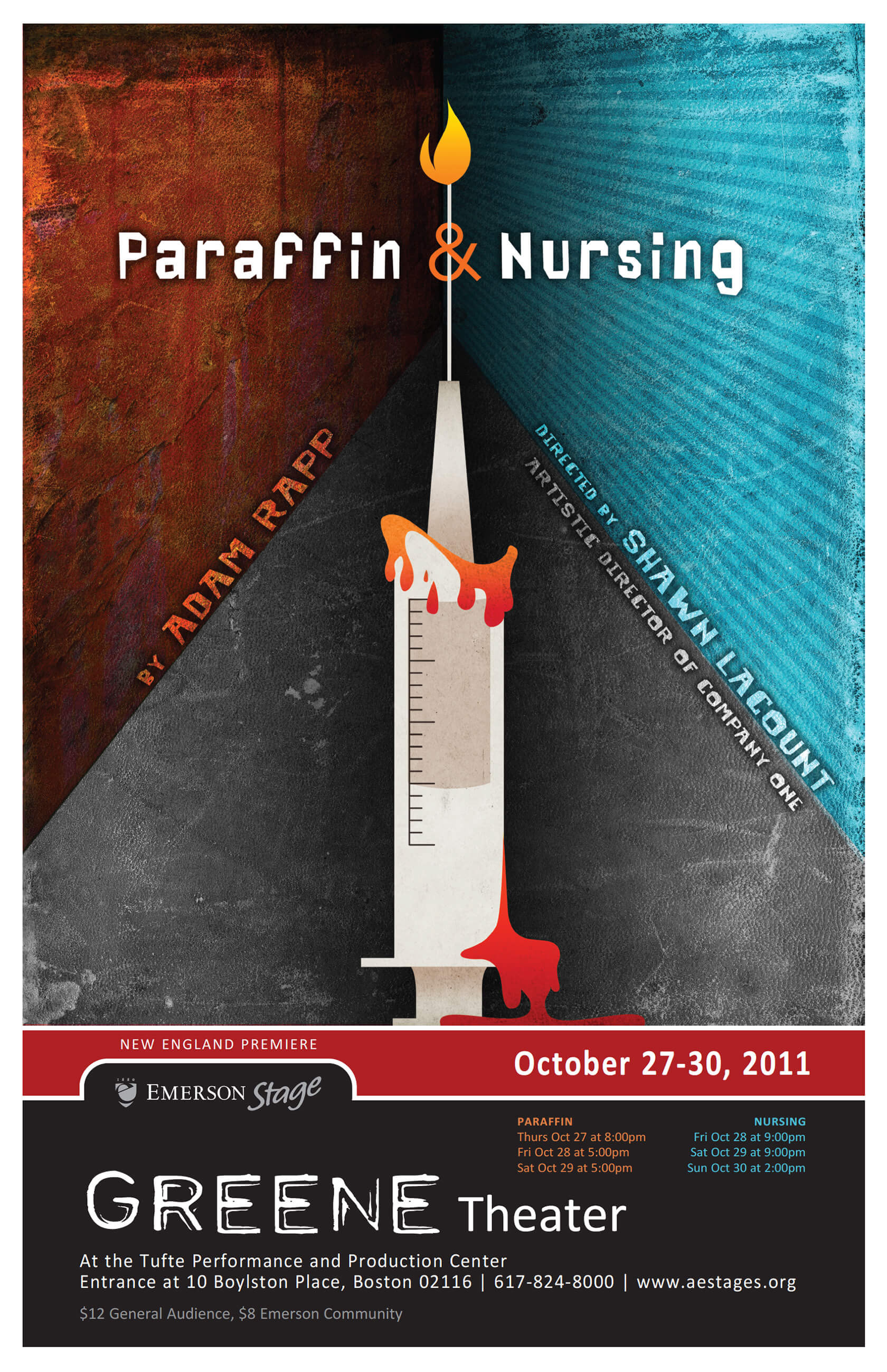
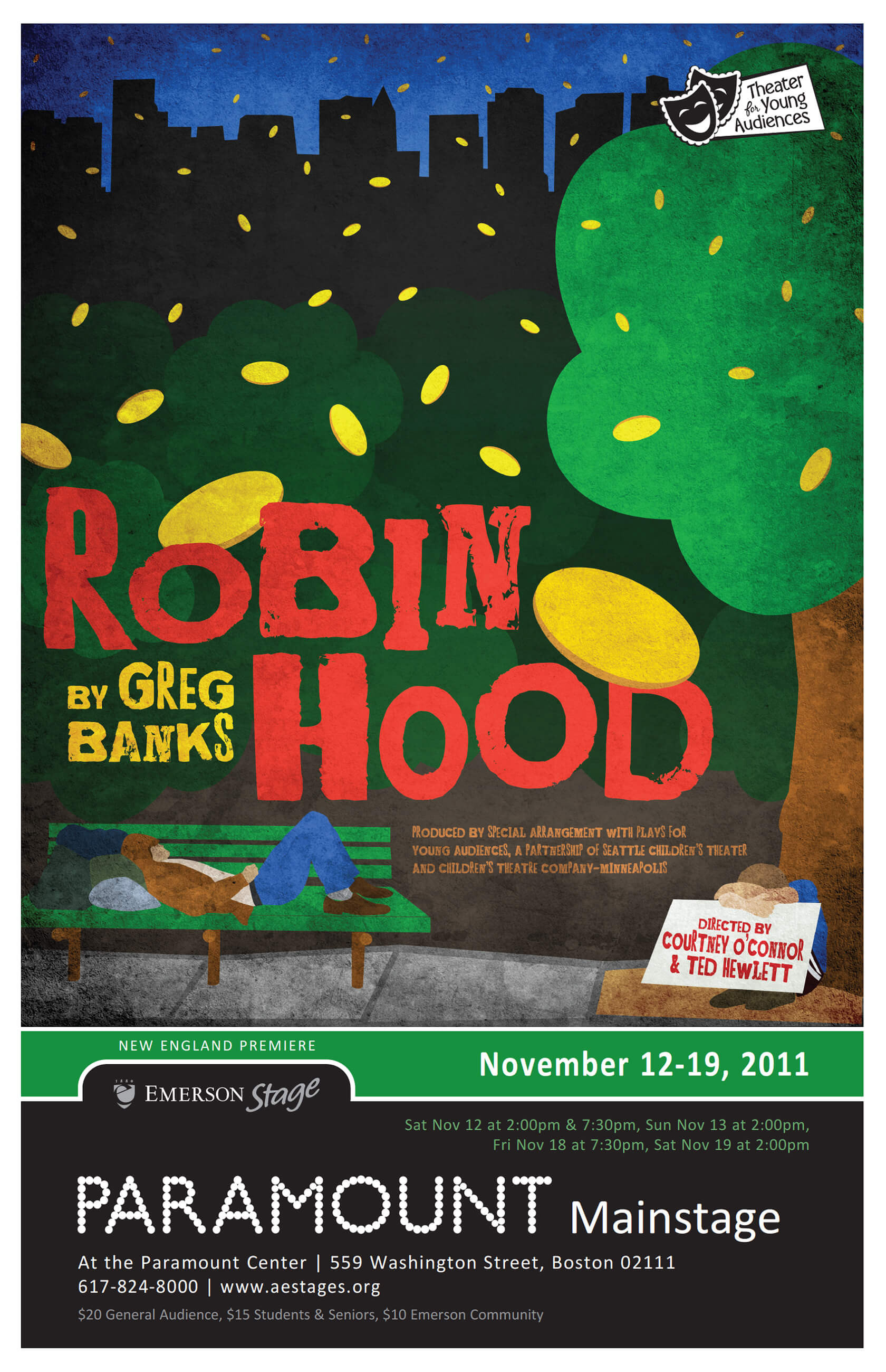
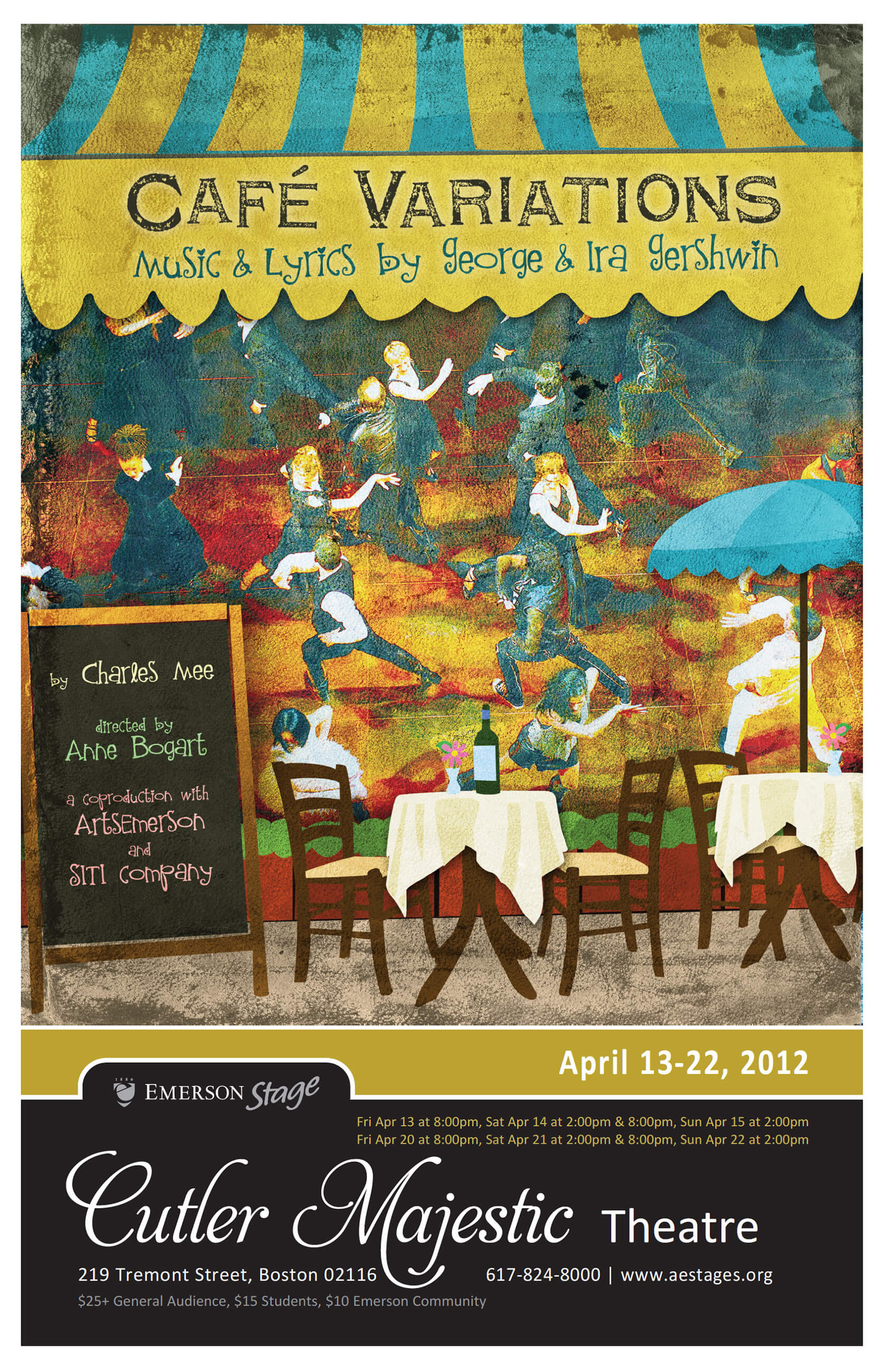
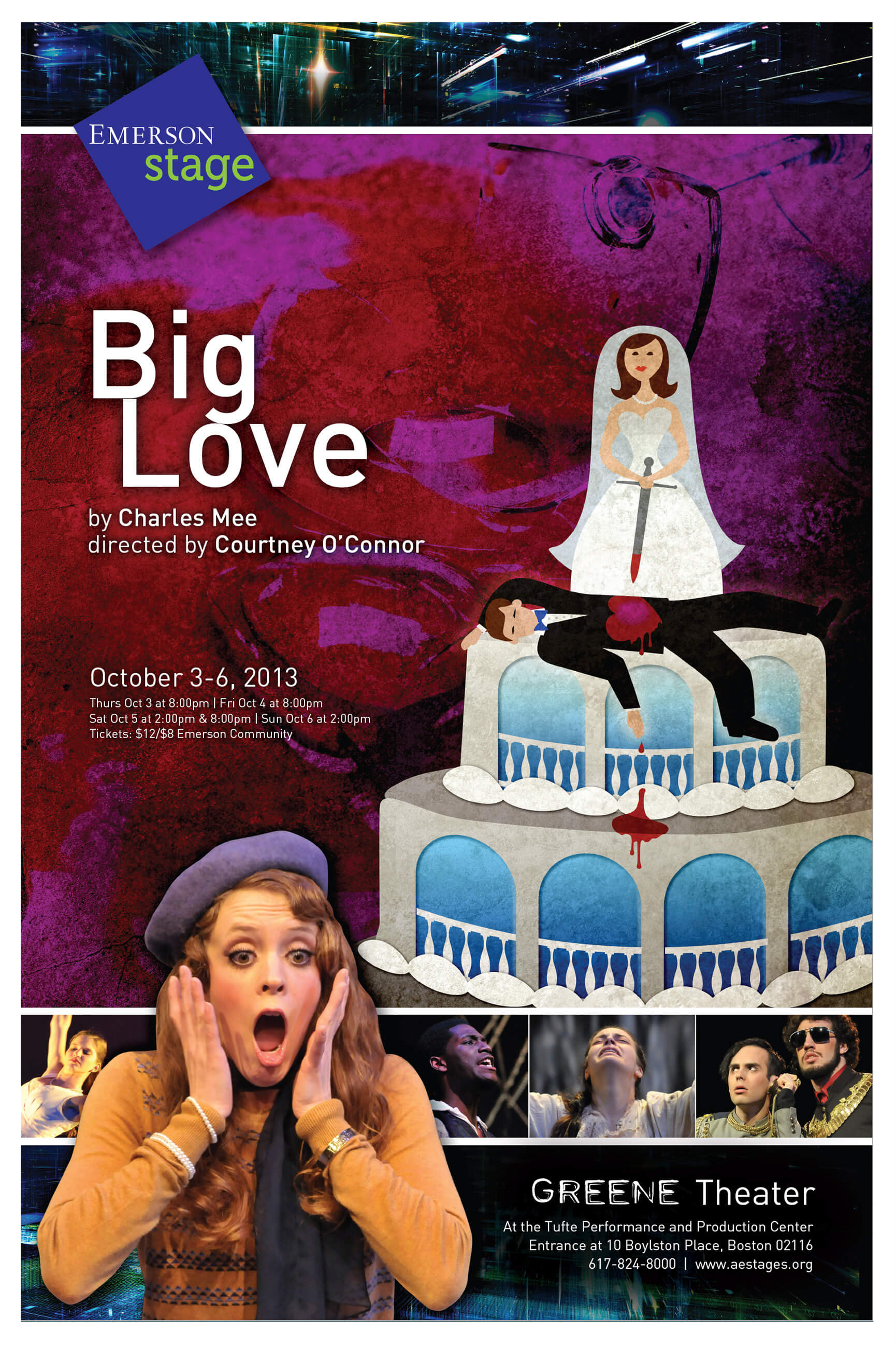
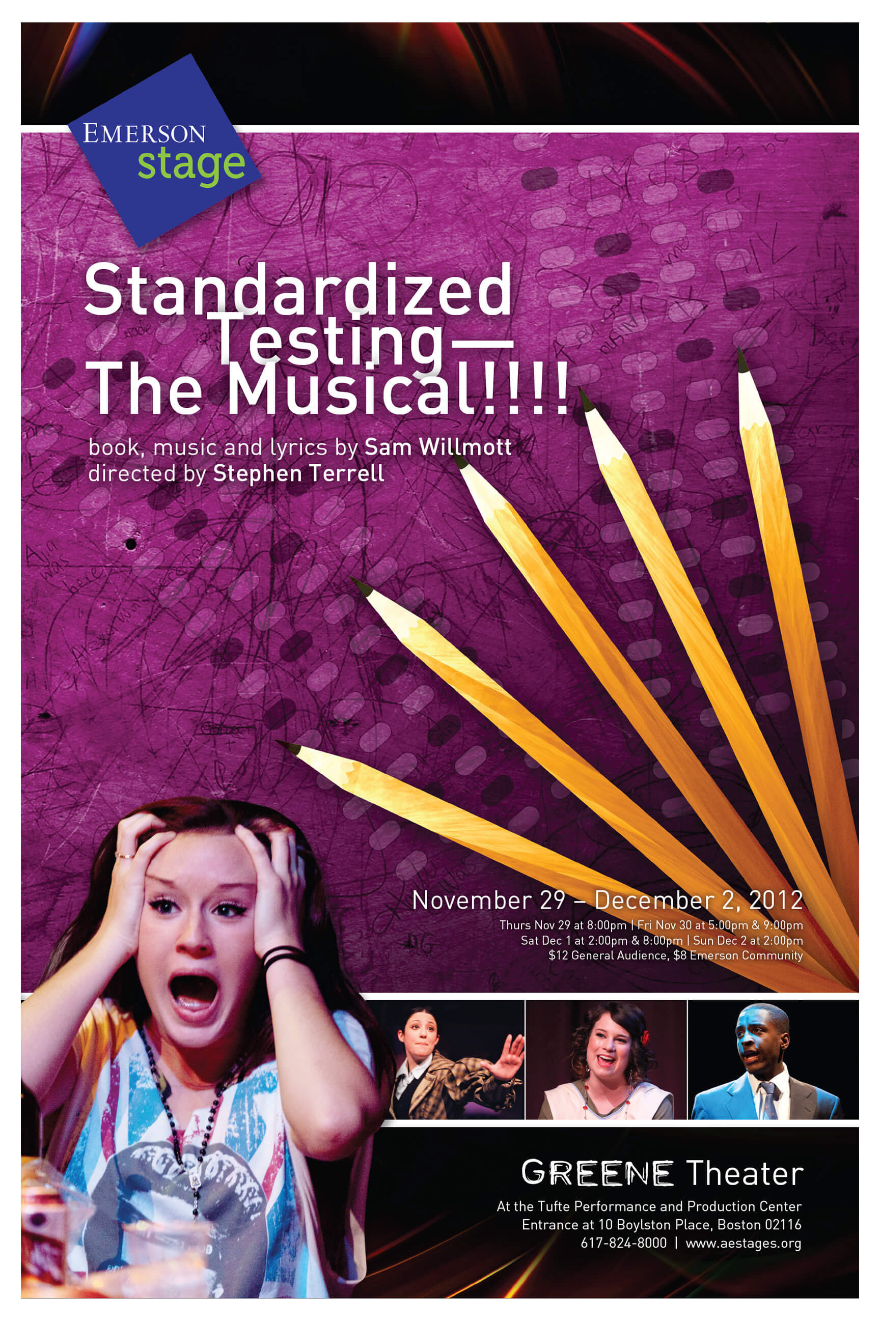
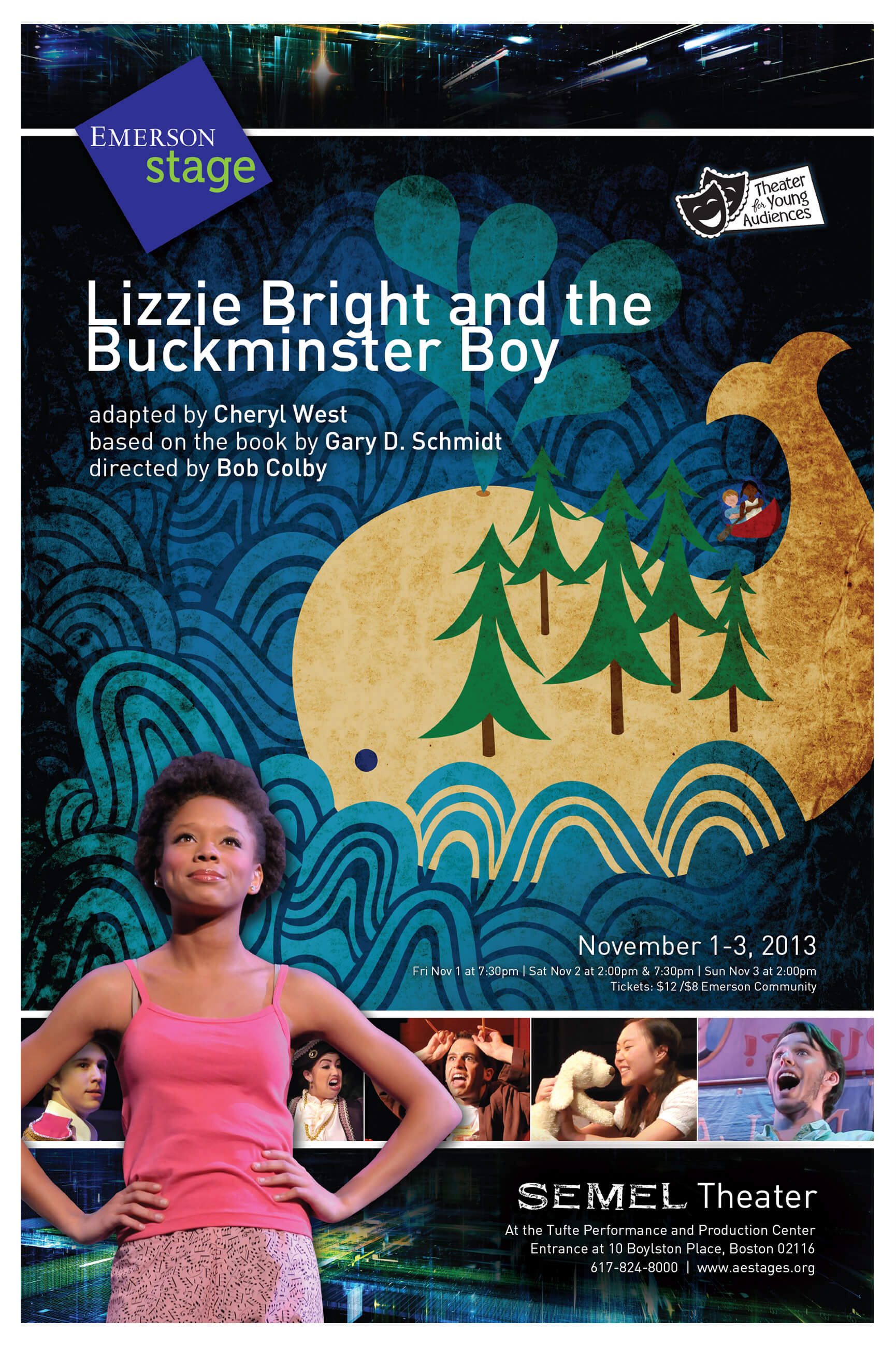
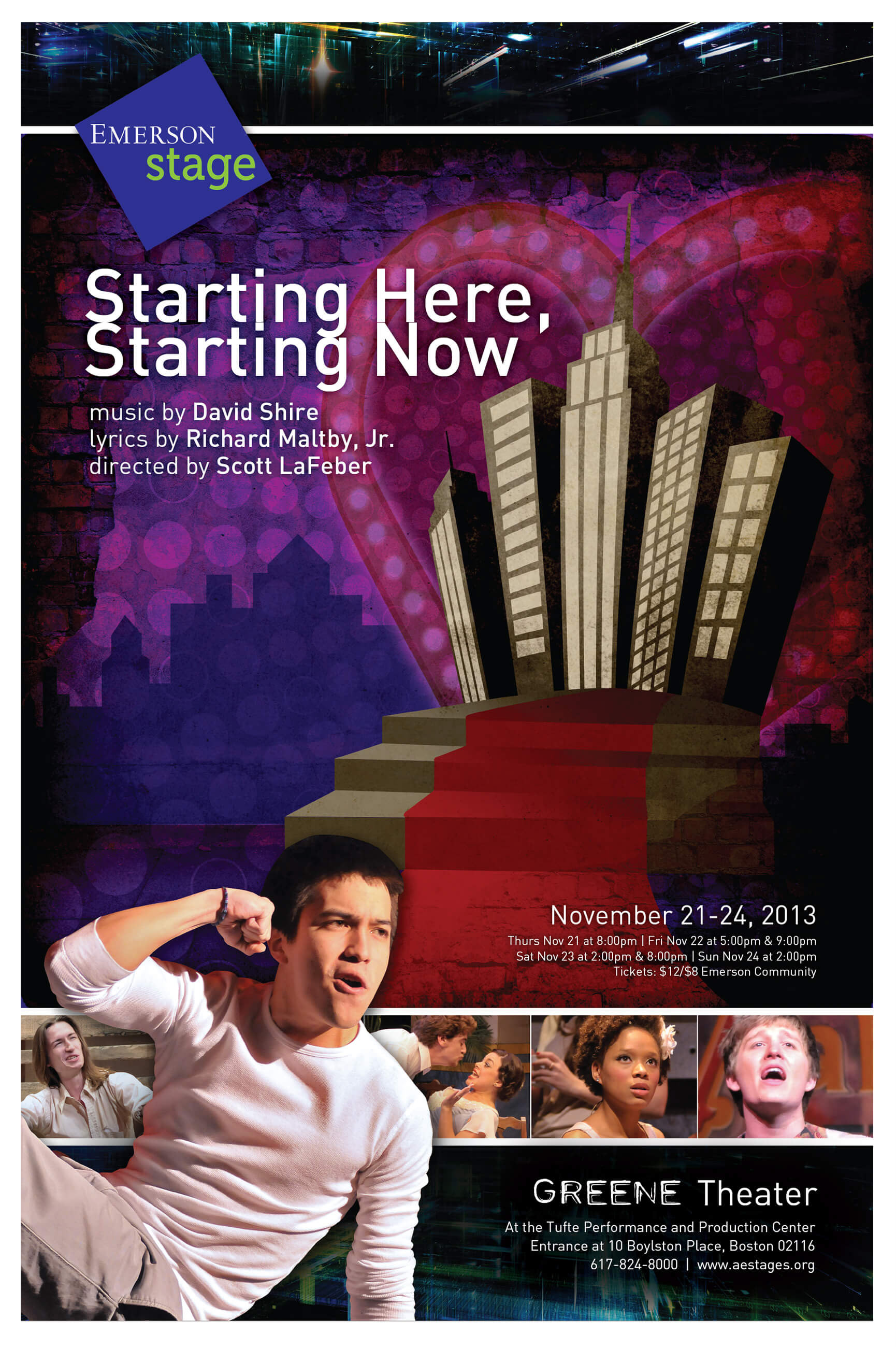
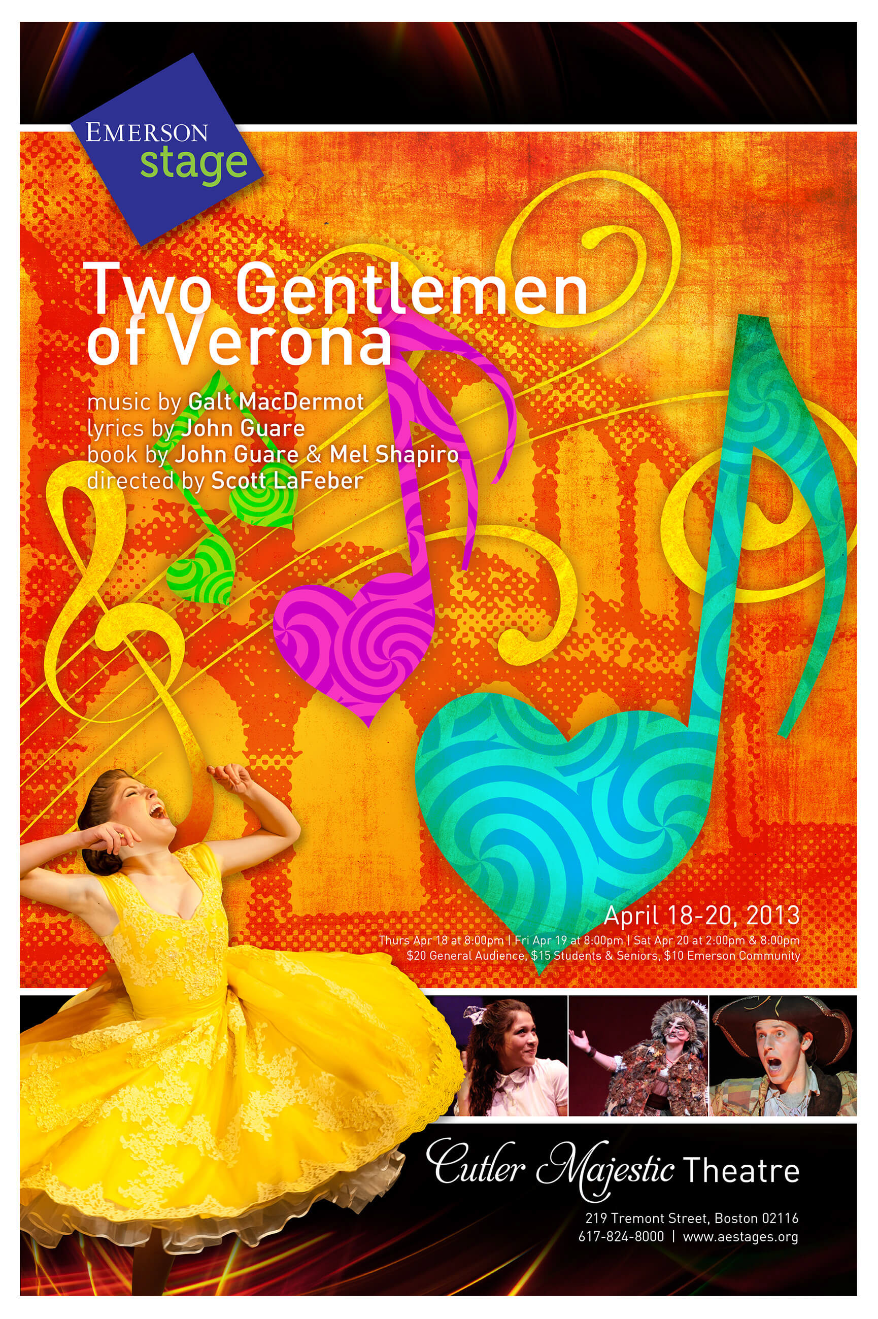
Showcasing my favorite poster illustrations from more than 30 designed over seven seasons. Click on each poster to closeup detail or scroll down to see the evolution of both the illustration style as well as the overall seasonal branding.
2009-10
The poster illustrations are created in Photoshop from a combination of rudimentary stock images as well as my own artwork with additional texture and creative typography. 11x17 posters were pasted all over campus, and 22x36 posters were featured in the theater lobbies.
Instructions accompany the accordion-folded seasonal brochure to tape it into a triangular tower shape to serve as a fun desktop calendar as well as a reminder for show dates.
2010-11
This next season featured the same illustration style, with changes to the theater footers. Light Up the Sky, featuring Boston landmarks, is a favorite.
2011-12
Posters carry forth the successful design styles of previous years, continuing to find subtly humorous visuals to convey the essence of each production.
2012-13
The goal: To better showcase the student actors—while maintaining the same vibrant illustration style—and to incorporate the new Emerson Stage logo for more consistent branding.
The challenge: The photography of the student actors is from different shows from the previous season, not the shows currently being advertised.
The solution: Poring over hundreds of photos from the previous season to find engaging silhouettes of students performing on stage, then using those images—alongside the current year's illustrations—to evoke the feeling of the upcoming year's productions.
2013-14
Continuing the success from the previous season.


